Bra Yam Township Steakhouse
Bra Yam is a South African smokehouse and craft brewery founded in Soweto by cousins Sifiso and Mandla Mthembu. What began as a makeshift smoker outside a carwash has evolved into a beloved brand that fuses smoky American low-and-slow with vibrant township flavour. Our task was to build a unified brand identity that feels as bold, welcoming, and proudly local as their food and beer.
Rooted in Soweto, Built Around Fire
About Bra Yam Steakhouse
Bra Yam’s identity starts with its origin story. We anchored the visual language in the energetic, communal soul of the shisa nyama — where smoke and spice bring people together in generosity and joy. The primary logo combines a bold, confident wordmark with a strapline that grounds the brand in its township heritage. A custom flame icon embedded within the mark reinforces the grilling theme without losing clarity.
Bra Yam’s colour palette draws directly from the smokehouse: Vivid Tangelo (the fire in the pit), Cultured (clean balance), and Raisin Black (depth and sophistication). Secondary hues like Imperial Red and Sizzling Sunrise add heat and energy, while Celtic Blue and Medium Sea Green offer occasional township flair.
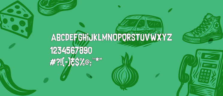
Headlines use Supersonic Rocketship — a bold, urban display font that demands attention. For body copy, the Montserrat family provides a clean, approachable contrast: Montserrat Bold for sub-headings, Regular for readable text, and Light for fine print. The tone is confident yet welcoming, avoiding all‑caps “yelling” while still making a strong statement.
We developed a hand‑drawn pattern that mirrors the eclectic, energetic spirit of the township. Built from custom icons — a smoke ring, a beer hop, a braai stand — it tells the story of heritage, values, and craft. Worded badges like “SHAP SHAP” and “EZ BRA” add an authentic, cheeky layer of local personality.
Bra Yam’s photography is honest and unfussy. Macro shots celebrate the smoke ring and the bark; hero product shots ground food on textured surfaces like weathered wood or galvanised steel; environmental photography shows food in branded packaging. Pitmaster pride shots invite guests behind the scenes, while customer vibe photography captures genuine, unposed moments of connection.
From takeaway bags and tray liners to interior restaurant walls and staff uniforms, every touchpoint reinforces the same bold, welcoming message. The design system is flexible enough to scale across OOH, digital, and merchandise, but disciplined enough to keep Bra Yam unmistakably Bra Yam.